
Wednesday, December 19, 2018
Tuesday, December 18, 2018

Tuesday, December 11, 2018
NEA; Test shots
I took over 100 photos to find the perfect shot for my front cover and double page spread. Taking so many photos made me indecisive, but I made the right decision at the end. One of my favourite parts of my non-examined assessment was taking photos as I used different lightings, angles as well as showing my model how to pose.
 |
| Pink background close-ups Showing skin and scarf |
 |
| Black background close-ups Black glittery dress |
 |
| Double page spread: White background close-ups dark lip colour |
 |
| black/blue background close-ups |
 |
| Blue background, close-ups red jumper |
Saturday, December 8, 2018
NEA; Flat plan
This is my flat plan which will help me out in the process of making my magazine.
This will not be the final product as I may be making change's throughout.

My drawings are not good and I haven't added colour to my flat plan however I have an idea that it will consist of white, dark maroon and teal colours.


Friday, November 16, 2018
NEA; Shot list
My shot list shows what types of camera shots I will be taking, this ranges from close-ups to long shots and side profiles.
 |
Thursday, November 15, 2018
NEA; Model Consent form
This is my Model Consent Form. The model has allowed me to take pictures of her and use them for my magazine.

Wednesday, November 14, 2018
NEA; Artist Profile
This is my Artist profile, telling you who they are, where they have come from and many more.

Audio of Artist Profile.

Tuesday, November 13, 2018
NEA; Research into Artist Branding
Branding is extremely powerful emotional trigger, and in some cases, more so than the music itself. Branding allows for emotional attachment, feeling related to something, and the feeling of belonging that people seek. In today’s industry, being a fan of a certain artists no longer solely means being a fan of their music, instead, it’s about being a fan of the overall brand that the artist defines themselves by. Branding is what converts fans into superfans; people only go to extremes for an artist when they feel closely connected to the artist themselves. This is why fans of certain artists feel compelled to line up for hours, sometimes overnight, for general admission concerts or events, just so that they are able to be that much closer to the artist. In some cases, fans can feel so emotionally attached to an artist that they feel compelled to remain devoted to them even if their music isn’t always at its best. However, this concept can also work against the artist as well.
Anjeni Laissez has also created a brand of her own called ᣠwhich stands for Angelic layer and of course Anjeni Laissez. The reason why Anjeni represents herself as Angelic layer because without her fans she was nowhere but now Anjeni's on billboards, radio and televion all across the world. Most of her time before fame, Anjeni Laissez was alone as her parents had died and her brother was busy all the time too but her fans are like her angels, taking her out of the dark. Now she is giving back something they could keep and be reminded of her.
 |
| Black hat with logo. |
 |
| White beanie with logo |
 |
| Bags with logos. |
 |
| T-shirts with logos. |
Monday, October 29, 2018
NEA; Choice of brand name
It was hard to choose a name that I liked and went with the genre, at the end I decided on the name Feud.
Feud means:

I believe in
music, especially in R&B and Hip-Hop the artist is battling their inner
self and outer self. The inner self is an
individual’s personal, internal identity - one that is distinct from identities
defined by external, social forces and relationships. It is closely linked to a
person’s values, beliefs, goals and motivations. This would appeal to the audience who at a young age are going
through a mix of emotions which they could relate to. I want my audience to
feel as if they are not alone and can look up to my magazine making them feel
strong.

Sunday, October 28, 2018
NEA; Statement of Intent
How you intend to use Media Language to target your intended audience?
How you intend to use Media Representations that are appropriate to your intended audience?
I aim to create an entertainment music magazine front cover and double page spread. My target audience is mainly girls aged 14-18 who like a mixture of R&B and Hip-hop. The unique selling point of my magazine is that the main feature is likely to be female artists that are new to the genre but has become extremely famous due to their vocals and lyricism.
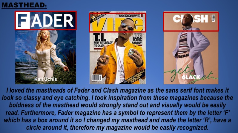
Masthead: Feud
I decided to name my magazine Feud because I believe in music, especially in R&B and Hip-hip the artist is battling their inner self and outer self. The inner self is an individual's personal, internal identity - one defined by external, social forces and relationships. It is closely linked to a person's values, beliefs, goals and motivations. This would appeal to my audience who at a young age are going through a mix of emotions which they could relate to. I want the audience to feel as if they are not alone and can look up to their favourite artists on my magazine, making them feel stronger.
Main Feature:
My main feature is going to be an upcoming artist who has a serious expression and you would easily notice they have gone through many life experiences from a young age but have achieved more than people aged older by simply being the; passionate, understanding, hardworking, humble.Colours: White, dark maroon, and teal blue
These would appeal to my target audience because these colours show authority as if the world is superior to them. White shows growth and creativity, dark maroons show's power and risk whilst the teal blue shows freedom, wisdom and loyalty.Representation:
The model would be good-looking, likely to be under 20 indicating the youthfulness and would dressed tastefully as simplicity looks beautiful. This reflects the audience self-image: young, pure, and somewhat powerful.Layout:
To further satisfy the audience I have made a decision for the shot to be a close up of my model, where her angle of gaze would be looking directly at the camera to show she is powerful and has come a long way in her musical journey. I will show this through lighting and facial expression. The model would also be showing bare skin up to her shoulders, so she doesn't look too animated and someone who they are not, reflecting the values of the magazine which is empowering female rap artists. Additionally, I want the model to have minimal makeup just to accentuate her natural features more.Sunday, October 7, 2018
NEA; Reader Profile
This is my reader profile which shows which type of person would be reading and enjoying my magazine.

NEA; Audience research - Focus Group (Part 3)
This is my focus group and I wanted in-depth details of what my audience prefer which will help me and guide me through the process. I got miscellaneous answers but most of the answers are similar therefore can help me with my magazine


Megane
What do you think about this front cover of 'ECHOES' magazine?
I think the background of Echoes Magazine is very bold which is able to successfully make the model stand out and also contrast very well together with the overall magazine. I also think the masthead being on the side of the magazine is able to give the whole magazine a unique look overall.
Kasia
What do you think about this front cover of 'Fader' magazine?
I quite like it. I like the contrast between the font and the image and I like the model on the magazine. If I was looking for a music magazine, I would probably pick something similar to that as it concentrates on the artist and is very different.
Nadia
What do you think of this front cover of 'XXL magazine?
I like the theme of the colours in the magazine. I like how it's black, red and white.
Mahjabeen:
What do you think about this front cover of 'Vibe' magazine?
I think the front cover is simple yet it pops and catches my attention. The big red 'Vibe' in the back looks really cool along with the information in the black boxes. It shows a style of hip-hop and can attract me with that aesthetic.
1. Would you buy these magazines? If so, which one?
Megane: Out of all these magazines I would probably buy XXL as all the artists being on the front cover makes me want to know what is inside the magazine itself.
Kasia: Out of all of them, I would pock the Fader magazine. It's the simplest out of all of them, but it still manages to grab your attention whereas the other ones have too of a wide variety of colours and you don't really know where to focus on the magazine because everything is all over the place.
Nadia:
I would buy the Echos magazine because I like the image in the cover, it really makes me want to see more of the magazine.
Mahjabeen:
I would buy the Fader magazine because personally, I like dark colours and the front cover with the close up attracts me.
2. How do these magazines fit in the R&B/Hip-Hop genre?
Megane: The standard colours I see in all of them are red and white, and I think that makes them fit the genre because I would expect to see those colours on a front cover of an R&B/Hip-Hop magazine.
Kasia: All of the magazines use the 'hip-hop' fashion style on their magazine as well as some hip-hop/R&B artists. The magazines use a lot of bright colours, such as red, to give off a very flashy vibe that goes with the genre. On the XXL magazine, the font is kind of messy and in a handwriting style rather then a printed which also gives off a very hip-hop vibe.
Nadia
They fit in the genre because of the bold style they are in i.e. the fonts are big, bold and bright. Also, the style of clothing suits the genre as well as how the artists are posing.
Mahjabeen
These magazines show R&B/Hip-hop because of the colours, fashion and fonts. The colours are bold and eye attracting. The clothes that the models are wearing also link to R&B/Hip-hip because they aren't just casual but they are layered and the designed which look very good. The fonts are written in capital, pops and shows confidence. Furthermore, the angle that the pictures are taken vary but all show a unique side of the model gives off perfect vibes for the genre.
Saturday, October 6, 2018
NEA; Audience research - (Part 2)
This is the audience research I did with different people age ranging from 14-18. I thought I'll get a general feedback from my audience first then do an in-depth research e.g. focus group which will give me an insight of likings/dislikes.

This was as expected of as I go to a girls school so, the survey showed me I have a large proportion of my audience will be girls. Regarding music magazine, if both genders have similar preferences I would like to incorporate features that please both genders.

From the research I conducted, I found out that the most popular response for the question was 'Rarely'. However because it was a younger audience I was asking the questions to, it was predictable as with wh technology, teens and young adults would probably able to find the same information on the internet, using a phone/computer etc. Nobody voted for more than once a week, but there were about 4 people who said they buy magazines more than a week and about a quarter said once a week.

This was a very important question for me to have answers from because this is is the question that will help me pick the genre of my music magazine which is going to be R&B/Hip-Hop. I chose these genres because they were the most common in my region which I though my audience would like too. I included other because I wanted my audience to have an opportunity to tell me a genre that isn't common. I am excited to produce a magazine an R&B/Hip-Hop magazine as it's a genre of music I listen too as well.

I also noticed the price of the magazine doesn't really affect a person making the decision to buy a magazine, but people focus on whos the artist is because that attracts them more.

The results for this question were as predicted. Again, it would be students and younger people who participated in the survey. and usually, younger people especially if unemployed, may not be able to spend over £1-£3 on a magazine, as there are magazines that can cost much more depending on if it includes any freebies.
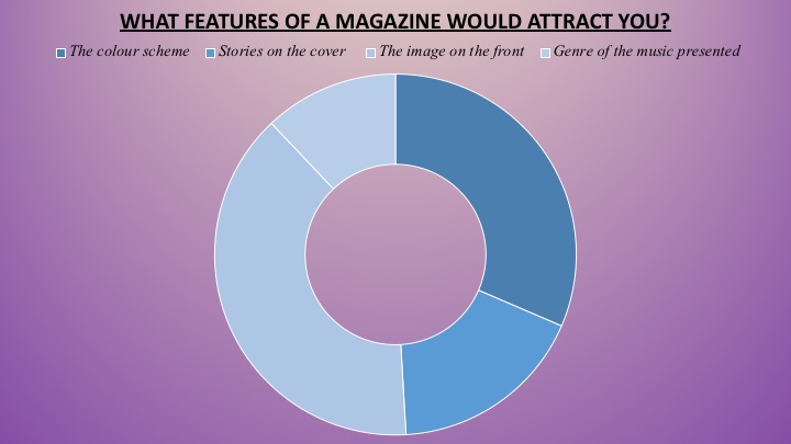
The colour scheme got the least votes for what would attract someone to buy a magazine, as usually, magazines can look attractive without an obvious colour scheme, but I think if it does have a colour scheme it just makes it look more professional and attractive as it looks tidier.
Friday, October 5, 2018
NEA; Audience Research/Analysis of results (Part 1)
This is my audience research and I had asked 60 people from ages 14-18 so I can get the top 2 most liked magazines out of the 6 magazines I had, which shows me Vibe magazine came first which tells me the most crucial feature my magazine needs to have is an artist as this is what attracted my audience the most. Nicki Minaj's colourful hair matching with the magazine makes the magazine feel like she is important rather than the cover lines or background.
NME came second which I thought was because of the image too. The magazine itself is very unique and unconventional because firstly the magazine is matching with the same design from top to bottom and there are 3 people rather then 1 main person. I think my audience likes unique features in a magazine. Lastly, the least favourite magazine was the Hip-Hip magazine this may be because the layout is too cramped and dark colours have been used which made it look unattractive.
From this research I want my magazine to be more image-based as that is more attractive.


Thursday, October 4, 2018
NEA; Research Rationale
On Prezi presentation I have discussed how I want to find out my audience research and market research.
Sunday, September 23, 2018
NEA; R&B/Hip-hop - Music videos
Here are some music video's that are from the genre of R&B/Hip-Hop.
Call out my name - The Weekend
Trip - Ella Mai
Sickomode - Travis Scott
The Weekend - SZA
Venom - Eminem
Get You - Daniel Caesar
Saturday, September 22, 2018
NEA; Music Magazine Collage
For my music magazine collage I collated recently published successful magazines so I can take inspiration for my own. I tried not take older magazines as it would have old conventions which might mislead me.

Friday, September 21, 2018
NEA; Magazine Typography
Here I have created a mood board of the different mastheads that music magazines have used. This will help me when it comes to me choosing the font for my own masthead as I can see what has been successful.
 |
| MUSIC MAGAZINE MASTHEAD'S |
This is a selection of music magazine fonts I have collected, and it clearly shows that fonts used on music magazines are very clear for users to read therefore we do not see cursive fonts.
Exceptions to this would be 'BBC Music', 'Modzik', 'Choir & Organ' as they are serif, yet they are easy to read due to the colours and spacing between the letters. They appear more handwritten which appeals more to their target audience. Those fonts were chosen due to the genre of music that they represent, as it suits their house style. and therefore another reason why they appeal to their target.
The other magazines such as 'Mojo', 'NME' and 'Vibe' have used block capitals, which is a common theme throughout as they are more modern and casual, which is an aesthetic that appeals to their target market, perhaps due to age. Also, as they look modern the target audience will be naturally more drawn to it, and therefore makes them more recognisable and helps establish the brand that they wish to portray.
The main colours used on the mastheads were black, white and red which connotes power, professional and danger. These 3 colour may emphasise what type of magazine they are for example 'Rollingstone' is deep red which makes me think their magazines of having rebellious, crazy and talented artists on the front cover.
Another example is 'Vibe' using the colour black which makes me associate with the words; death, evil, dark, mystery. This makes me think black almost gives the vibes of fear and unknown.
Lastly I want to analyse 'Prog' as it's not a magazine you would see generally. This is mainly because of its unique font that gives a quirky vibe. This also tells me that the audience this appeals to enjoys unconventional artists and stories. The bizarre font connotes to hippy and odd causing the magazine to stand out to viewers. The colours of white and a black background emphasise the unusual wording of 'Prog'. I personally would not choose this as its too funky for my liking.
Thursday, September 20, 2018
NEA; Magazine deconstruction
I did a deconstruction of a successful R&B magazine so I can see what features to include in my own magazine.

Wednesday, September 19, 2018
Monday, September 17, 2018
First Post!
Hello everybody, my name is Neeha and welcome to Media Boss Vibes. This blog will be my portfolio for my Media studies non-examined assessment which is to make a music magazine. I'll be showcasing my initial feelings and the whole process from research, planning and development.🖤
Subscribe to:
Posts (Atom)
-
 This is my Artist profile, telling you who they are, where they have come from and many more. Audio of Artist Profile.
 -
 This is my focus group and I wanted in-depth details of what my audience prefer which will help me and guide me through the process. I g...